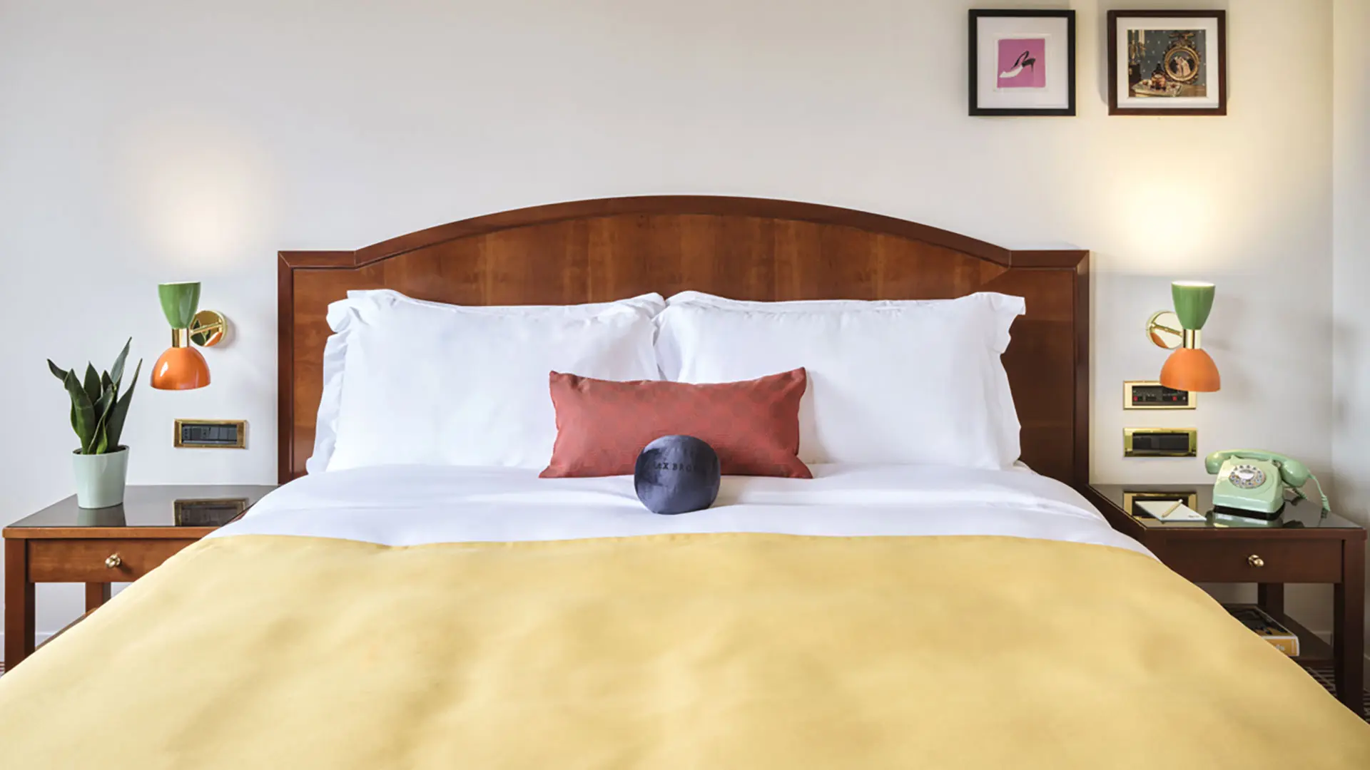
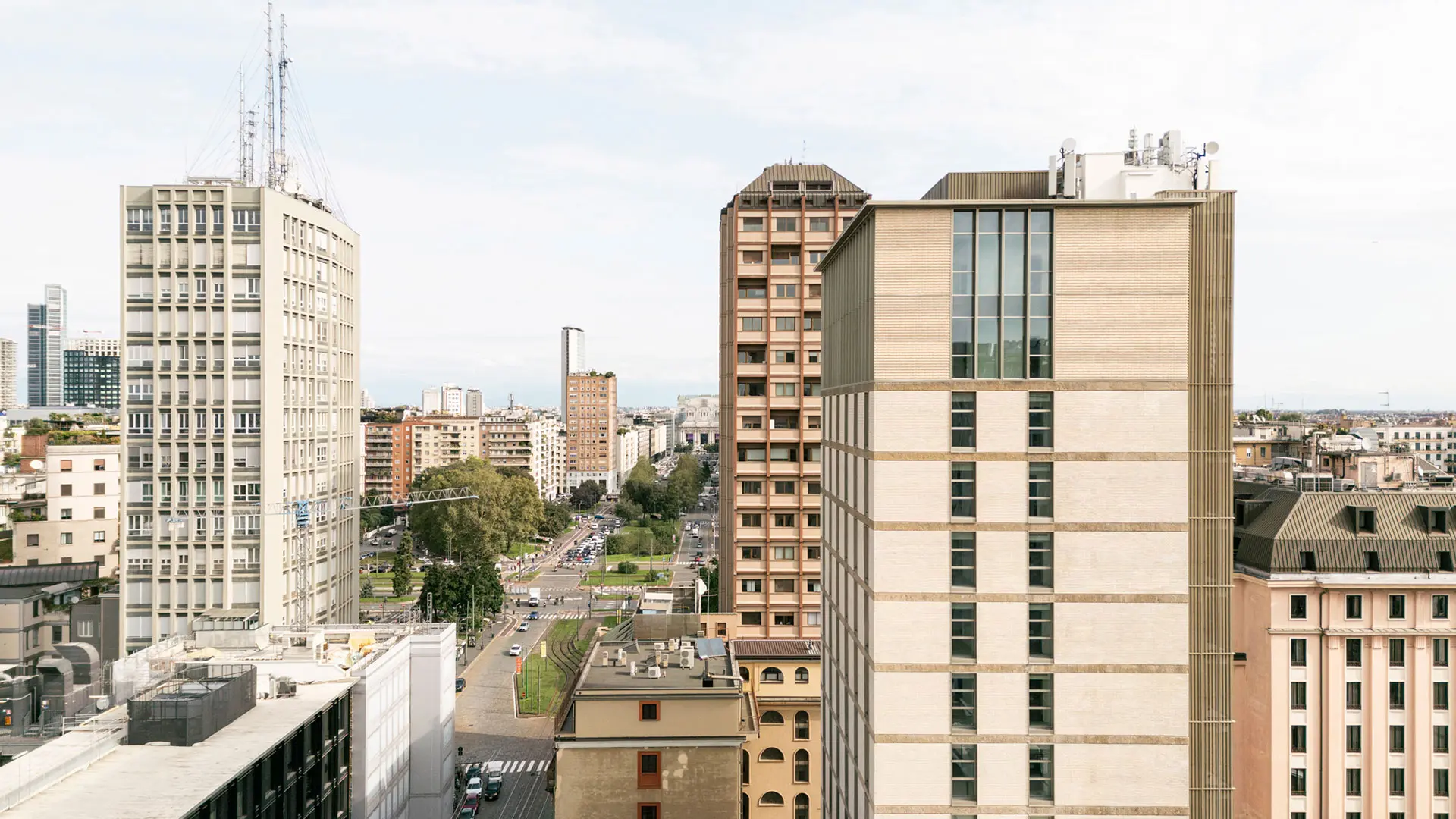
In partnership with MiCodmc, a selection of establishments ripe for discovery during the 63rd edition of the Salone del Mobile.Milano, from 8th to 13th April
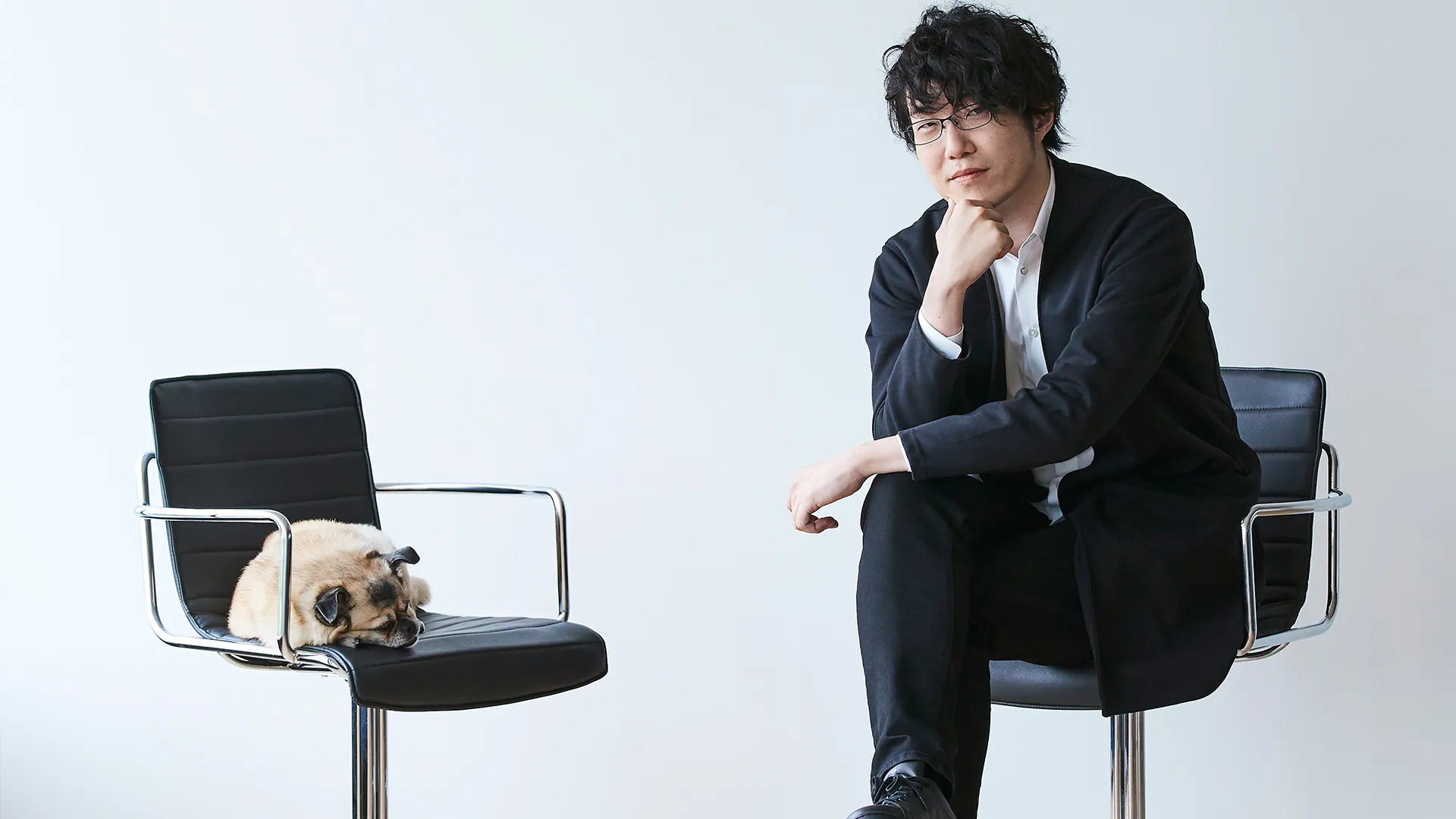
In a little under twenty years, we’ve learned to recognise his “signature,” Oki Sato, alias nendo, talks to us following the publication of the second volume of his biography
He made his debut at only 25, but the promise of his early projects were an indication of the swift trajectory that his career was about to trace. This did not escape the Italian companies. Exacting, ironic, essential, far-sighted and poetic sum up his trademark style in the many objects and installations – and now buildings too – which he churned out at a rapid rate from his Tokyo studio, with its office in Milan. This speed does not detract from the consistency, nor from the objectives of his clients, who always find a universal reason in the results. More than revolutionising design, he has bolstered the foundations of good design with a unique vocabulary capable of exploring the present in order to speak of the future to the contemporary world. Anything but simple, therefore, despite the apparent simplicity of what he does to those who look at it and use it.
I believe my prolific output is simply down to my nature as a designer. To take a culinary analogy, I think there are designers who excel at creating dishes that require slow cooking, such as stews, while there are others who produce dishes that require skill and hinge on freshness, such as sushi, at a rapid rate. I belong to the second category and, focusing on the freshness of my ideas and producing them at a rapid rate, I believe I’ve been able to generate a virtuous circle that allows me to remain open to new inputs.
I’ve got 8 3D printers in my studio in Tokyo, which are constantly on the go. I use them to concretise my ideas in three-dimensional format as quickly as possible, while I try to boost the quality of the design. Personally, I’m not attached to any particular tools, as long as I’ve got paper and pen within reach, I don’t suffer from stress. I spend my days making sketches, photographing them with my smartphone and sending them to the team of designers.
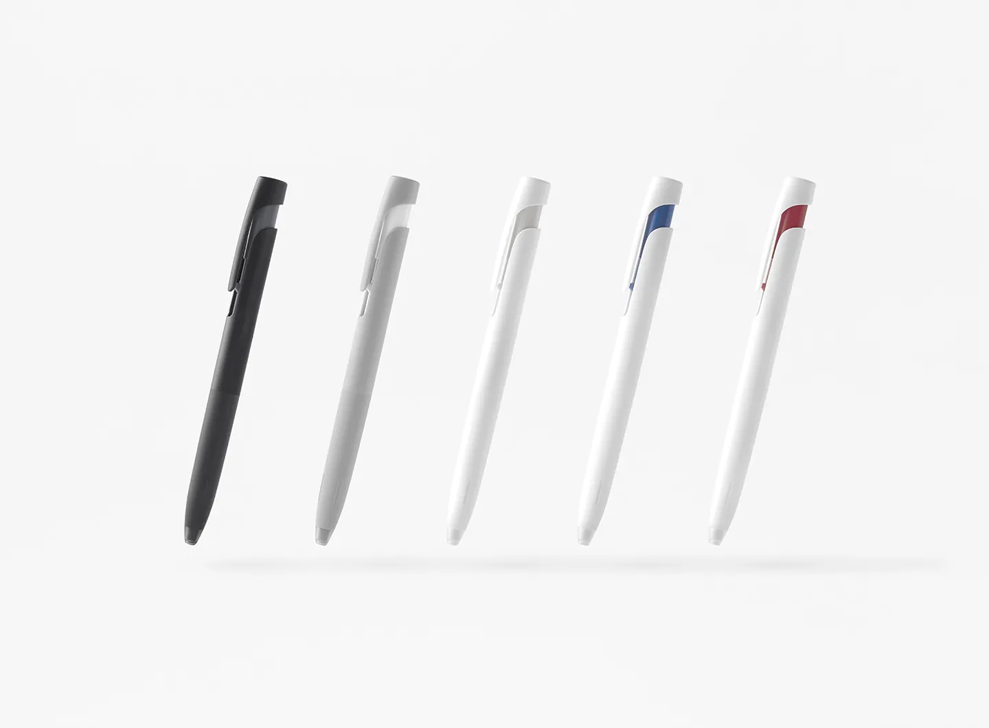
There’s no particular difference. If anything, I try to “serialise” the ideas I’ve got in mind, so that I can go on and explore their possibilities as fully as possible. What I get out of this process is a single object, while what I do not get out of it, and which evolves by itself in a particular ambit, becomes a series or a variant – I’d say that this is the concept. So, the process is the same, the only difference comes from whether it derives from the presence or the absence of the last stage.
I believe the essence of design is considering the relationship between people and things, people and space, people and people. I think that constantly paying attention to people’s behaviour and emotions sparks new ideas and new values.
I was born in Canada, where I lived as a child until I was 10. Then I lived in Tokyo and since becoming a designer, I’ve spent a lot of time in Italy. Given this baggage, it was perhaps inevitable that my style should be informed by the fusion of different cultures and thinking.
When we use the word “fusion” we end up almost giving the impression of wanting to force things that have no correlation together, like putting sashimi on a pizza …
But in this case, the best way of putting it is to liken it to being a “foreigner” wherever one is, with the ability to look at things at one remove, which gives you an opportunity to find new “points of contact” between different cultures.
In the past, I’ve designed a lot of exhibition spaces and collaborated with other authors, but this project was quite different. Normally, discussion with the other party in the collaboration is crucial, but that wasn’t possible in this case. Furthermore, given that the protagonists of the spatial composition were the “objects on show,” mine should have been a secondary role, but I was asked to express myself as an artist in this project. So I formed an imaginary “nendo” and an imaginary “Escher” in my mind, and I made them confer with each other, giving the impression that the exhibition design was the result of their collaboration. Of the almost 160 objects on show, a sketch in the hand of Study for Drawing Hands (1948) alone was exhibited at the beginning, while the Study for Drawing Hands (1948) piece, in which two hands appear to be drawing each other, was exhibited at the end – this too was deliberate, because I wanted to pass on to the visitors the genuine feel of a project that I had embarked upon alone at the beginning but with someone else at the end.
Yoshida’s photographs exude a “dynamic” fascination, capturing the moment at which small, coloured balloons filled with water hit the ground, change shape in mid-air and bang into each other. This is why, when it came to displaying his photographs, I realised that there was no way their expressivity could be “static.” I kept turning over a series of possibilities and the result was a design solution that involved making some acrylic panels on which the photographs were printed and making them float, using the smallest possible amount of material, so that their shadows fell in the space and increased the floating feeling; also, the slight ripple of air caused by the visitors as they moved around made the works sway. Plus, given the possibility of children wanting to touch the works on show, we made sure we had reserves, so as not to have problems if they had fallen down and broken (gives a knowing smile, Ed.)
As a designer, rather than pouring all one’s strength into defeating an adversary, as one does in boxing, I think it’s important to capitalise on the energy of the antagonist, as in judo. A comment made in passing by a client, the lengthy history of a brand, the rubbish around a factory – there are lots of these sorts of triggers, and I’d say that giving them a little stimulus can produce a spontaneous and fascinating result. All this is very different to the designers who bring “what they want to do” to the table and impose it on the clients. For me, it’s important to adopt an approach that allows the fascination and intrinsic value of the interlocutor to emerge.
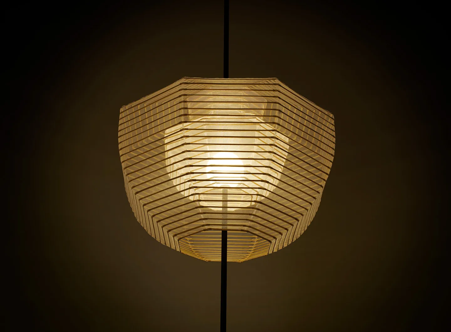
I believe that people are creatures that feel fear and negative emotions when confronted with things they’ve never seen or tried out before. So it’s important that it should be cutting edge technology that provides those points of contact with analogue, giving people a sense of déjà vu, along the lines of “I’ve already seen that somewhere” or “I think I might have used it before.”
It should be something that gives a strong impression of having always stood in a corner of your granny’s room.
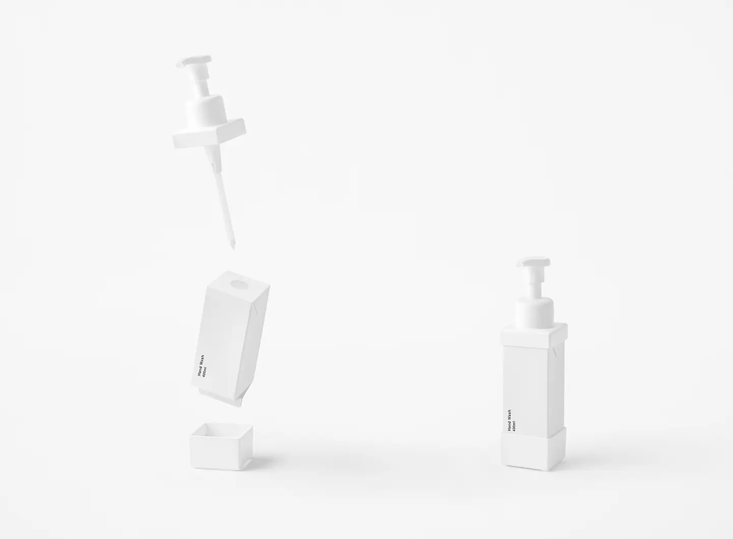
When I’m working on a project, when it comes to the colour of shape of the object, I focus on the narrative the object itself might bring to the context and on how to transmit this to as many people as possible. The more one tries to tell a story as clearly and honestly as possible, the more opportunities there are to come up with a simple expression that eliminates all the unnecessary fiddle-faddle around the object. One thing that I’m currently trying to watch out for is that if one makes a design too spare, there’s the danger that the object in question will transmit a feeling of cold and tension to people. I think that by adding in other emotions such as humour and surprise – just as if they were pinches of spice – a greater feeling of familiarisation with the objects will be generated.
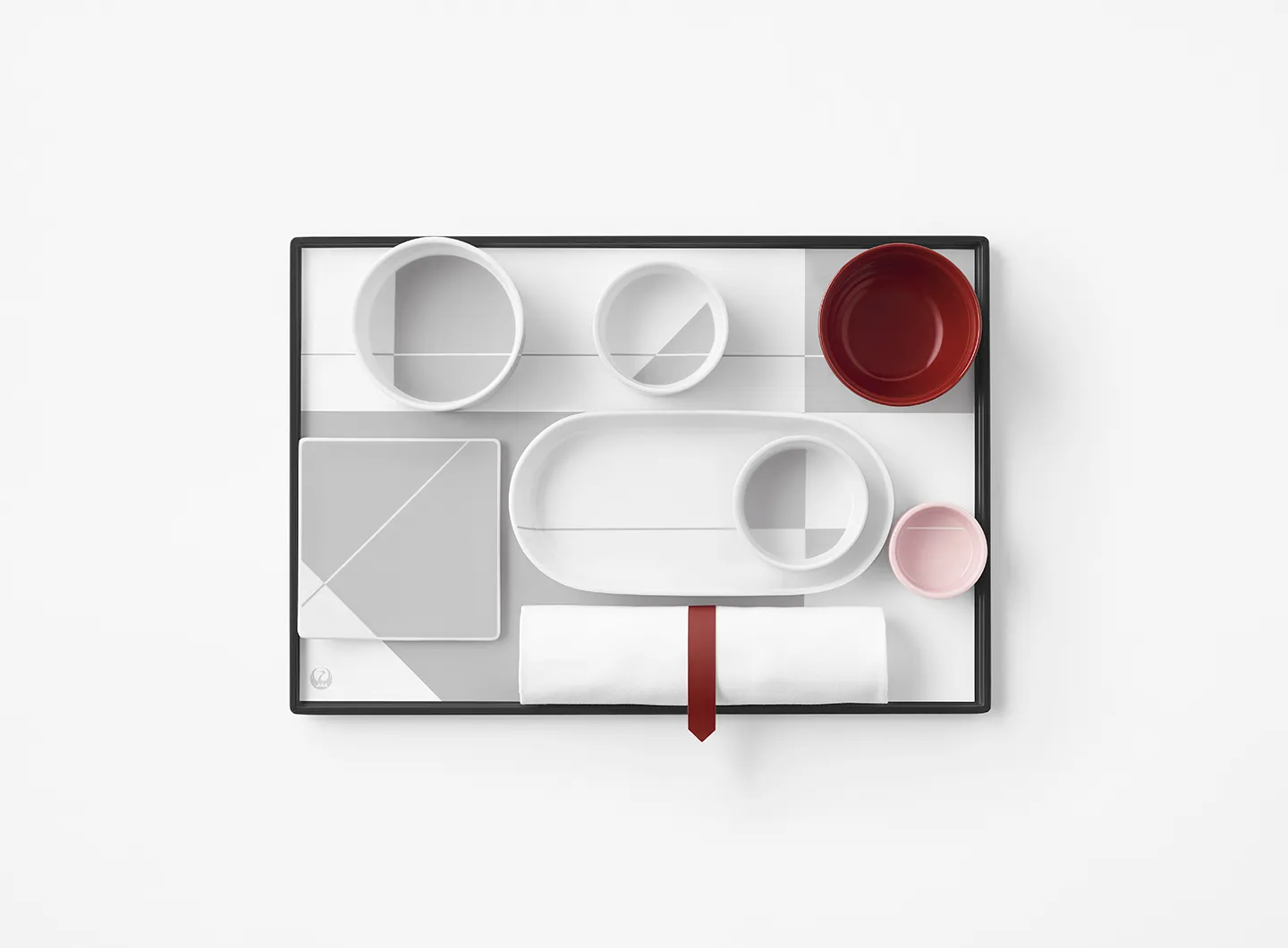
There are so many differences that if anything it’s harder to find similarities … (gives an ironic smile, Ed.). When I first started working with Italian firms, I was sometimes thrown by the lack of certainties when planning a project and in the modus operandi.
After twenty years, I’ve more or less got used to working like this and now it’s me who feels tied down when I work with Japanese clients, and I even think it’s me who throws them with my relaxed attitude (declares with a smile, Ed.). I realise that the passion and love of the Italian companies for design are values that other companies abroad could learn. Plus, the feeling that the designer could be a “member of the family” of the company is peerless, and I think this plays a crucial part in developing designers’ abilities to the full.
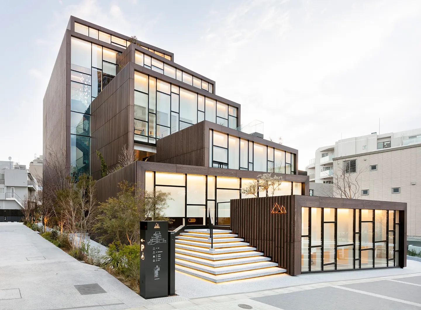
Throughout history, innovative designs have appeared around the world at times of transformation rather than in periods of stability. The world is witnessing a huge change of paradigm as a result of the crisis triggered by Covid-19, and there are people who will not accept this change and try to bridge the gap with previous lifestyles, while others try to adapt to the new lifestyles, with values that are more diversified than ever, and realise that all this is leading to an explosive increase in new demands. I think the world is crying out for design like never before.
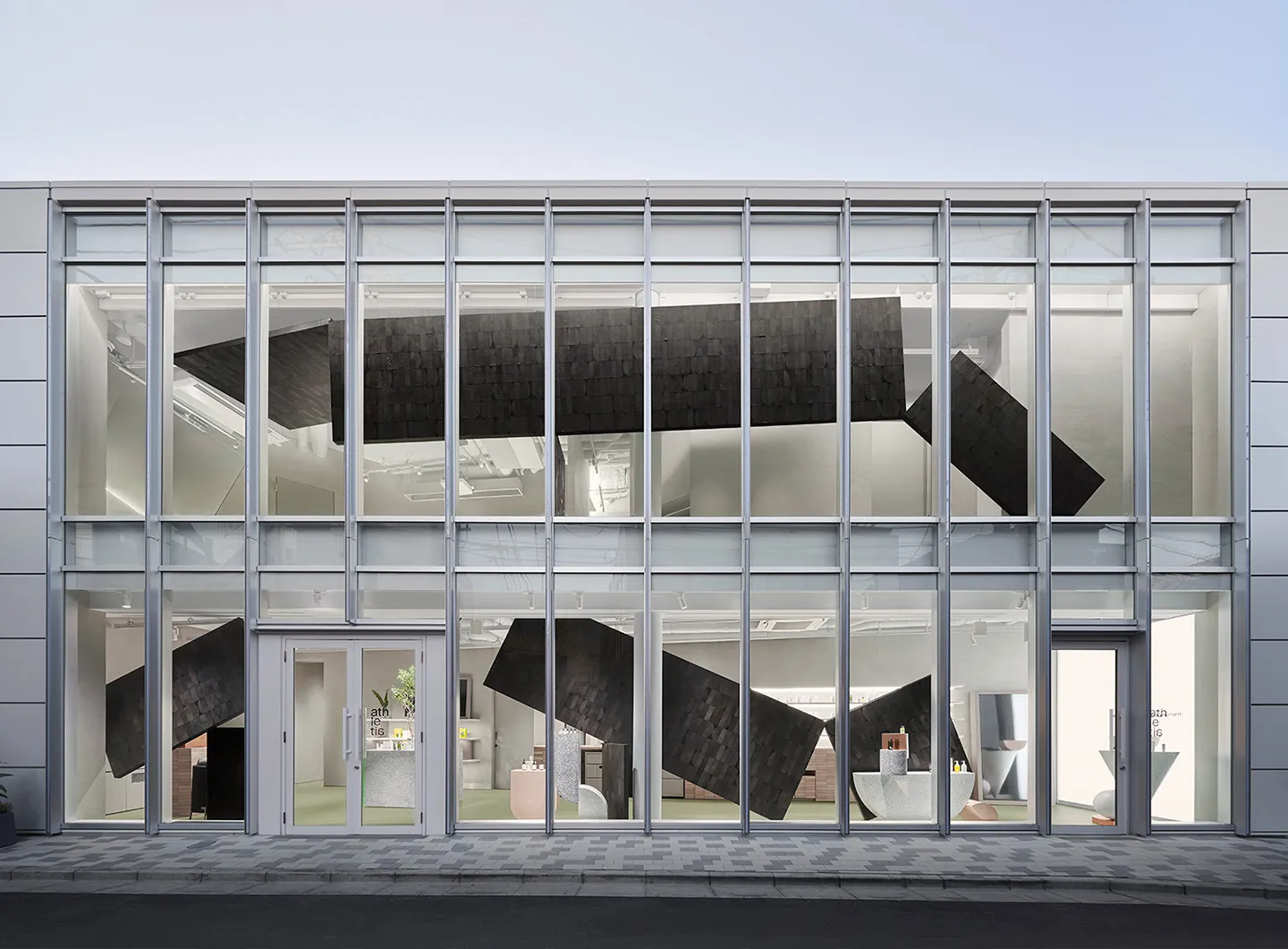
I studied architecture at university for six years and, for twenty years, I took an architectural approach to design. Now how can I apply the experience of these twenty years to this discipline? I think that interest is beginning to turn towards the possibility of expanding the spheres of architecture, bringing new perspectives to its interiors. I think that rather than being a very ambitious challenge, it’s a case of how to apply one of the different parallel themes, which the principles underpinning production are unlikely to change much compared with the past.
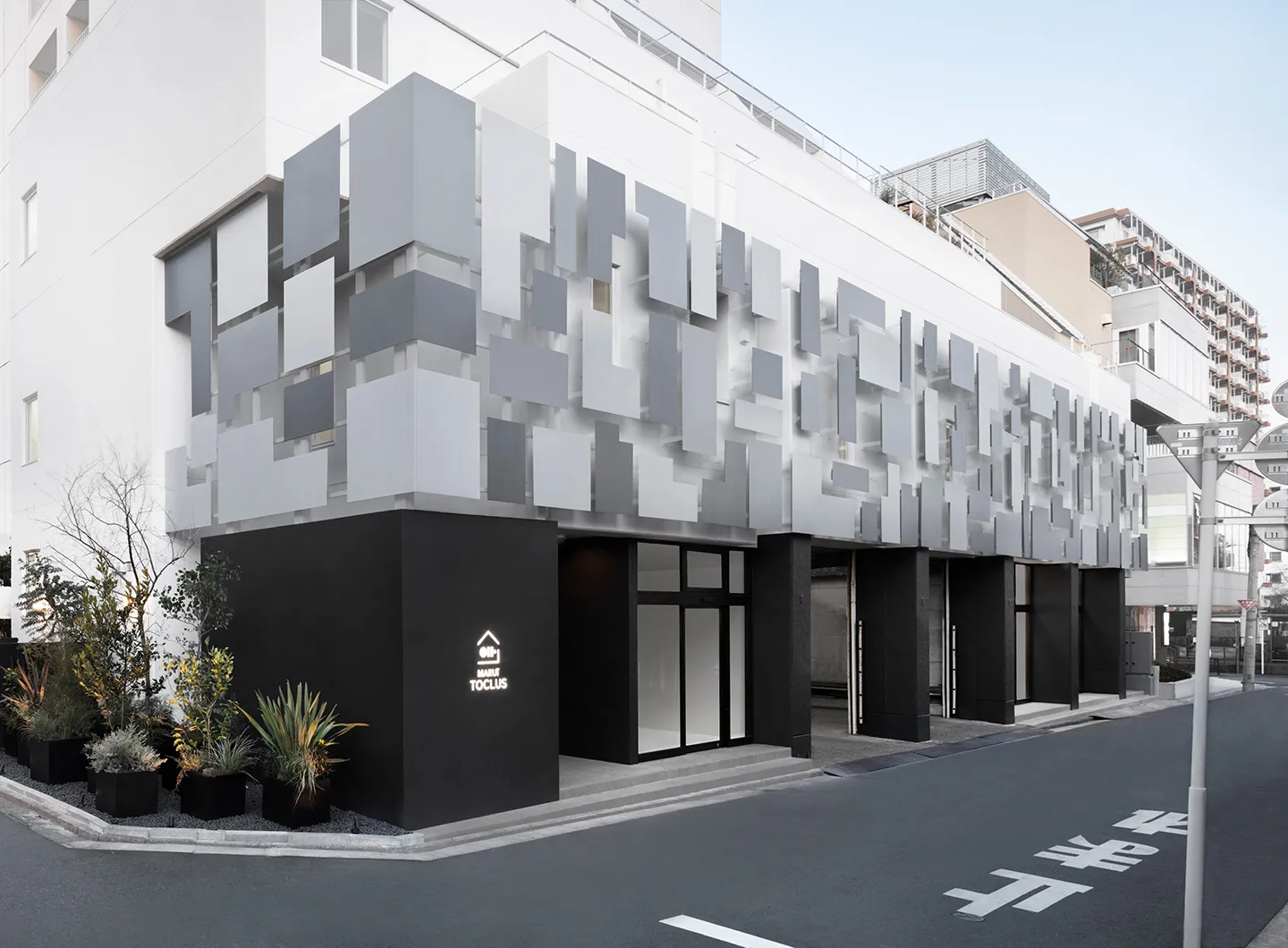
Design projects in less usual sectors such as medicine, sport, food, farming, fishing, transport and urban developments are on the rise. I hope I will be able to contribute, if only a little, to future society, tackling each of these projects with care and authenticity.


 Exhibitions


