In partnership with MiCodmc, a selection of establishments ripe for discovery during the 63rd edition of the Salone del Mobile.Milano, from 8th to 13th April
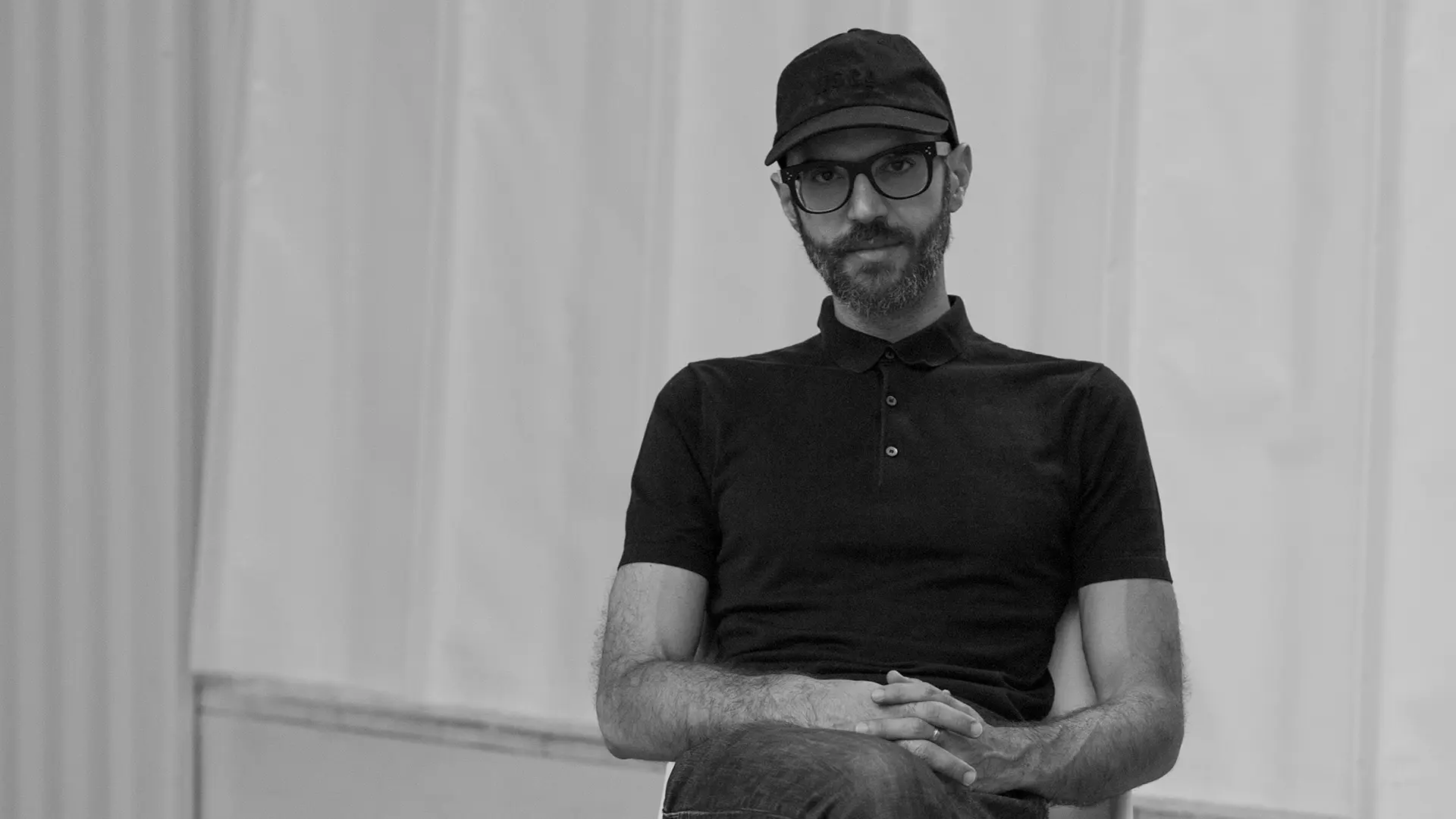
Photo by Ioan Pilat
One of the leading contemporary Italian illustrators, for him design is an assumption of responsibility. Variations on a theme are forbidden. Finding new languages, worlds and emotions is imperative.
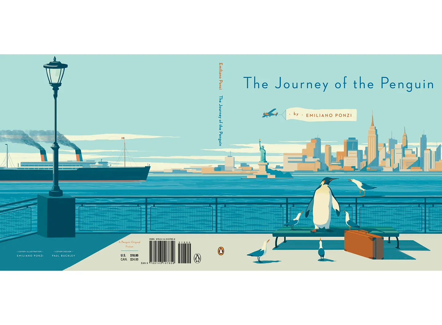
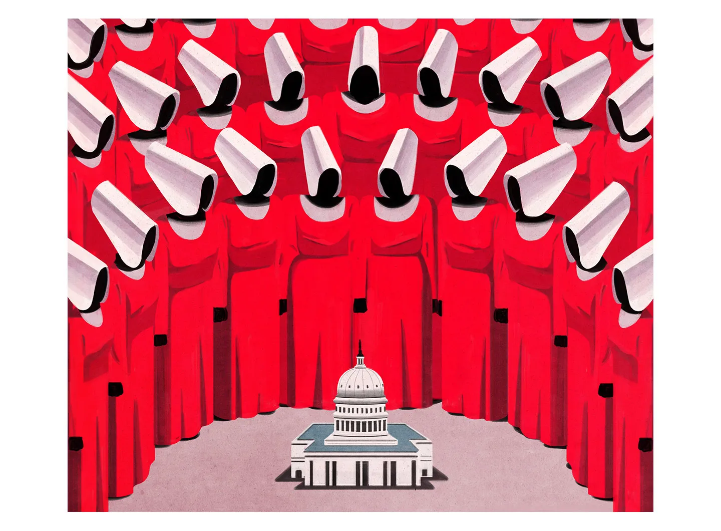
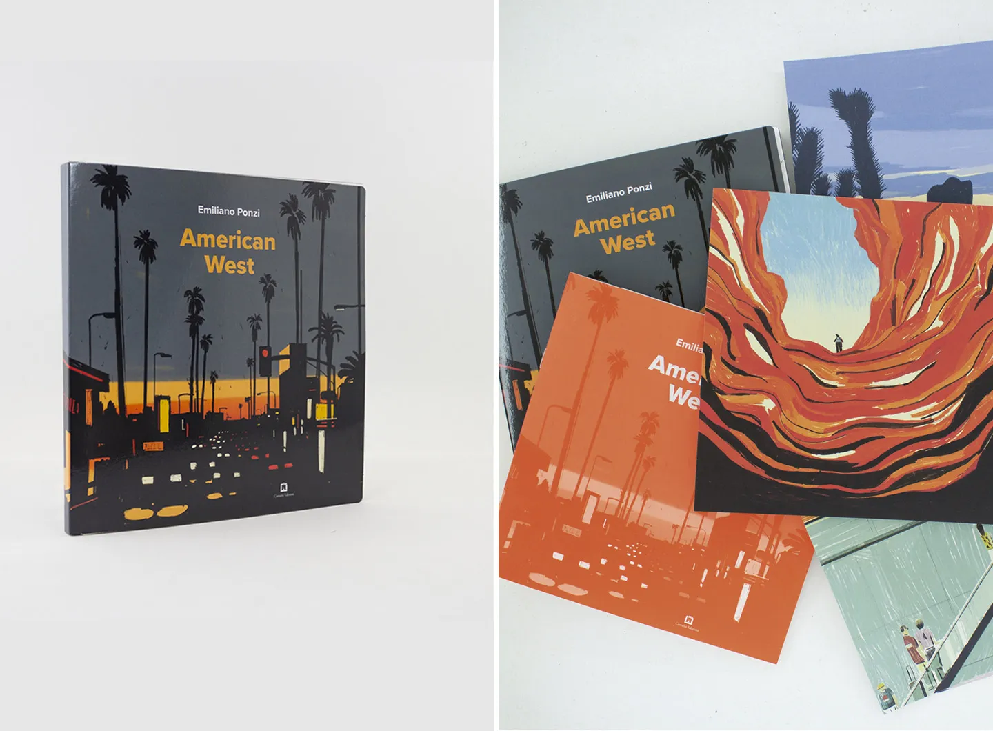
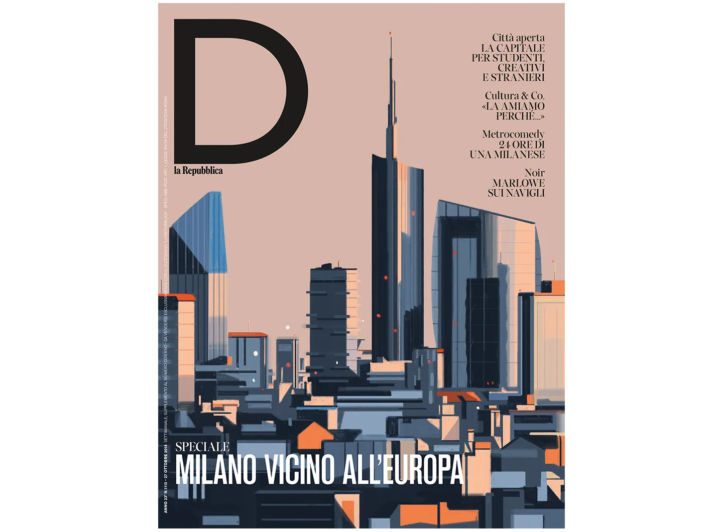
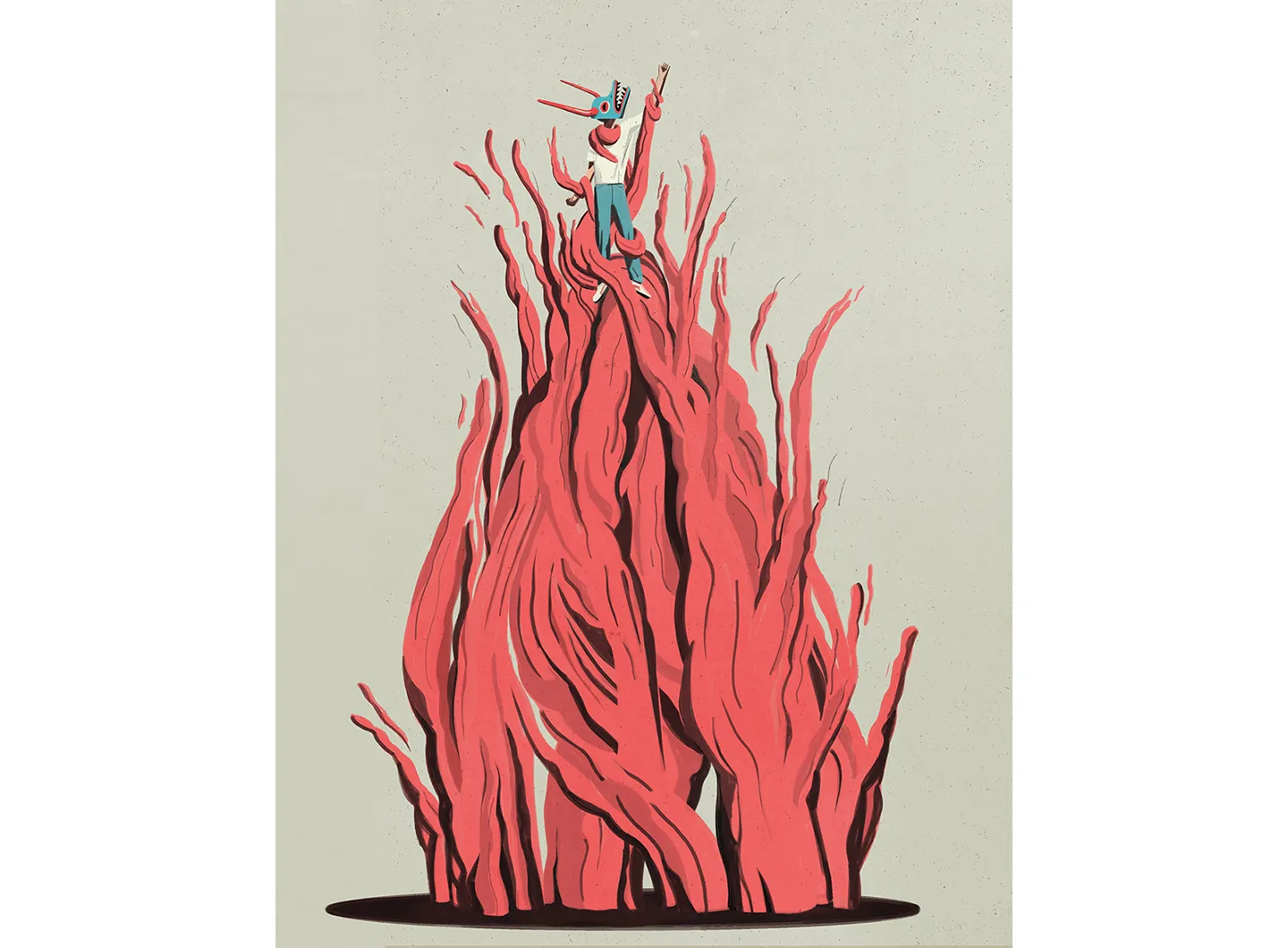
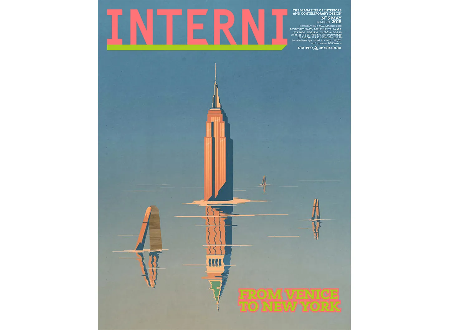
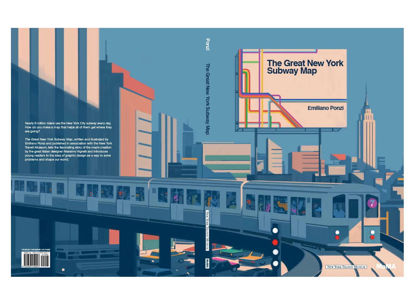
Knowing how to tell stories, communicate, engage and design in a style that is unfailingly personal, original and distinctive isn’t given to many. There can be no doubt that Emiliano Ponzi is one of the gifted few. Now one of Italy’s leading (and youngest) contemporary designers, he has designed book covers for publishers such Penguin Books, Feltrinelli and Mondadori, and illustrations for newspapers and magazines including the New Yorker, the New York Times, Le Monde and La Repubblica. He has also worked with La Triennale di Milano and companies such as Louis Vuitton, Bulgari, Armani, Ferrari and Lavazza. His projects also include the illustrations for the murals at Milan’s Tre Torri Purple Line underground station.
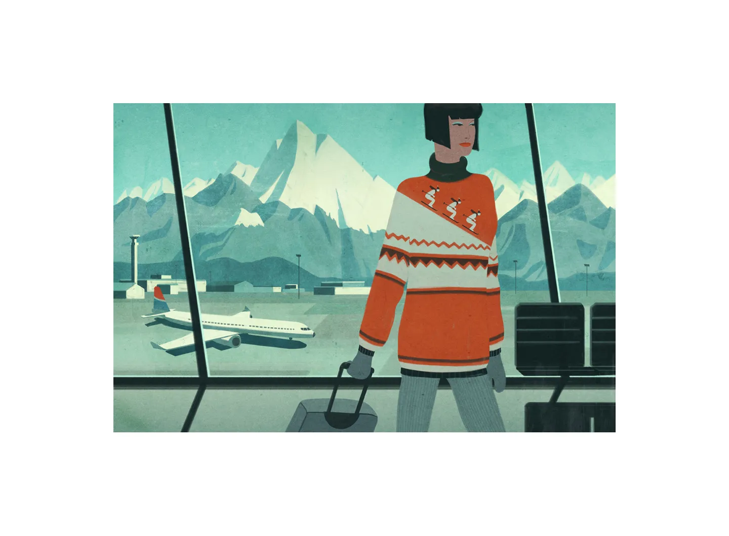
His professional life is split between Milan and New York. His brushstrokes are simple and essential, delicate yet precise, his atmospheres enchanted, almost metaphysical, and his message part elegy and part memory. This “trademark” style has become recognisable the world over, earning him an enviable raft of international honours: the Young Guns Award and the New York Art Directors Club Gold Cube, medals of honour from the Society of Illustrators in New York and Los Angeles, the How International Design Award, and awards for excellence from Communication Arts Illustration Annuals and American Illustration Annuals. All this in the blink of an eye. Emiliano Ponzi is “only” forty years old.
There are places where I feel partially at home. Slippers give me the creeps, if I get too comfortable I try to make myself less so, I often sleep on the sofa, and not out of fear of squatters. Perhaps being stateless is a state of mind, in which you feel as though you’re in transit but you never get to the final destination. The way I approach my work is the same – changing shapes and colours that I am now too familiar with in a bid to come up with new combinations. Adding, then taking away, working and then reworking in order to achieve a finer line, that unexpected colour combination. Never making copies of oneself, not producing the umpteenth variation on a theme – when I’m working I need the certainty of not knowing beforehand what the definitive result will be. This what authors and travellers do. They seek out new languages and new worlds.
I didn’t realise it, I chose it. Choosing design means always having it as a travel companion, linking arms with it, walking with it, nourishing it, being careful it doesn’t hurt itself too much by falling. It means taking on a huge responsibility. I have to constantly improve the dialogue with the thought that the mind imagines what the hand transfers onto paper or the computer. My greatest ambition is to keep getting “better”, making an even better design the next morning than the one I left on the table the night before.
One great experience made up of microcosms. Every commission has different rules and demands which I always approach in the same way – mediating between the demands of the client and the expression of my personal vision of the finished article.
I really liked that book of Kandinsky’s but I only understood it many years later. It taught me the need to create one’s own aesthetic system. Care and attention to every shape, striving for less conventional morphologies and considering future dialogue with one’s own artistic alphabet.
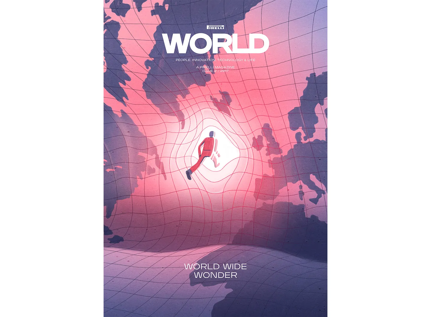
I don’t think there is an unethical relationship between analogue and digital. The kinetic sculptures experience was amazing. The Fablab makers helped me discover the ad hoc mechanisms hidden behind the sculptures – lights, rods, magnetic iron powder, photocells. Equally, I was astounded and amazed when I produced the 5 Virtual Reality illustrations for Pirelli: I painted a boundless world made up of white light in which the images could be seen from every angle. I believe that every tool (“old” or new) is in fact just an instrument for an ultimate communicative end.
That’s a very complex question; singling one out would be denigrating the other colours that serve to create the suggestion of an image. With a gun to my head, I’d say that blue is probably the most versatile, the one I prefer using in all its different tonal variations.

In memoriam: David Lynch
The American director has left us at the age of 78. The Salone del Mobile.Milano had the honor of working with him during its 62nd edition, hosting his immersive installation titled “A Thinking Room”. An extraordinary journey into the depths of the mind and feelings. His vision will continue to be a source of inspiration.


 Stories
