In partnership with MiCodmc, a selection of establishments ripe for discovery during the 63rd edition of the Salone del Mobile.Milano, from 8th to 13th April
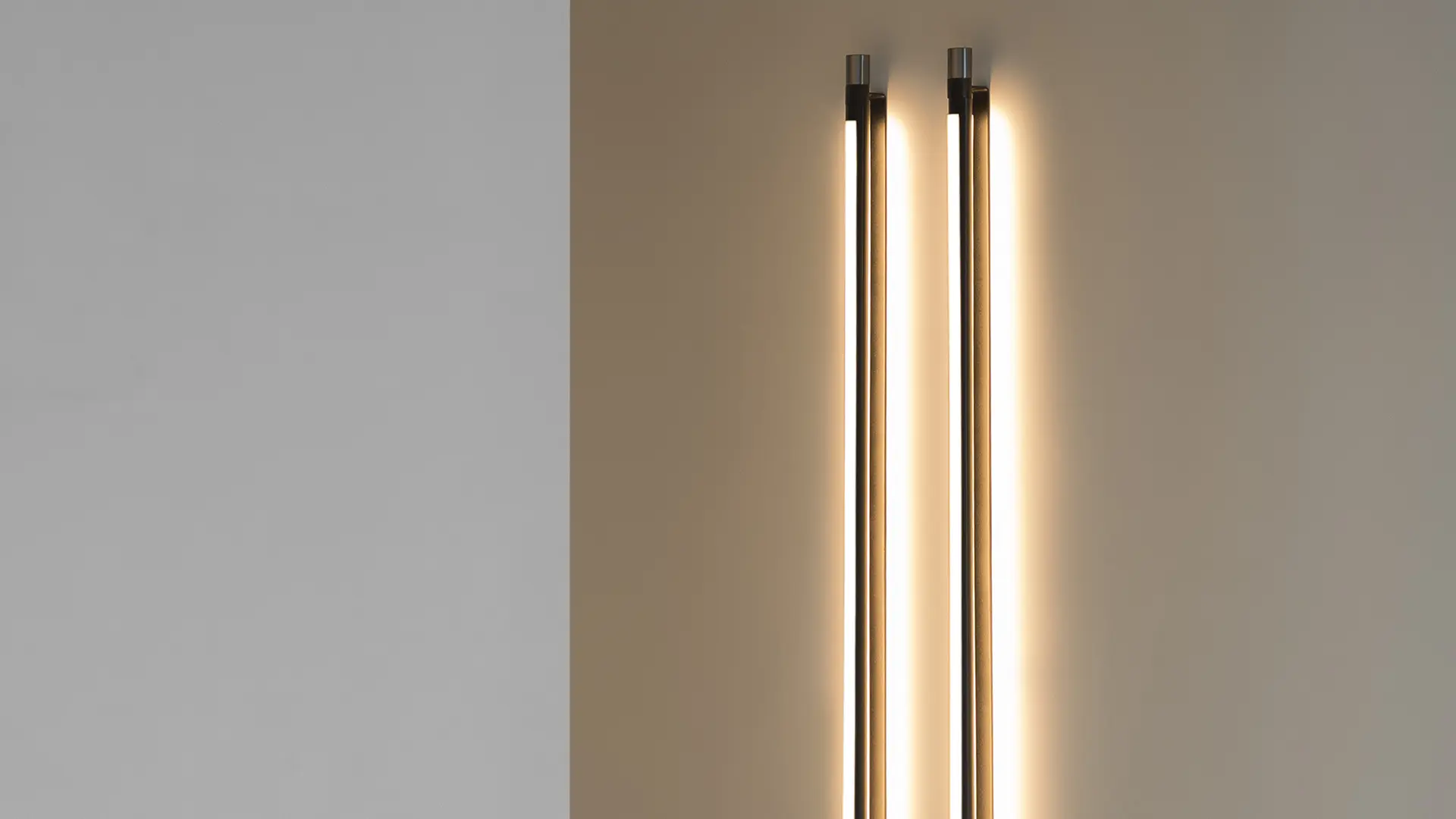
Tooy Thula by Federica Biasi. Ph. credits Silvia Rivoltella
The Milanese designer just won the EDIDA 2021 “Young Designer of the Year” award. Much like her sources of inspiration, our long chat ranges between Scandinavia and Japan.
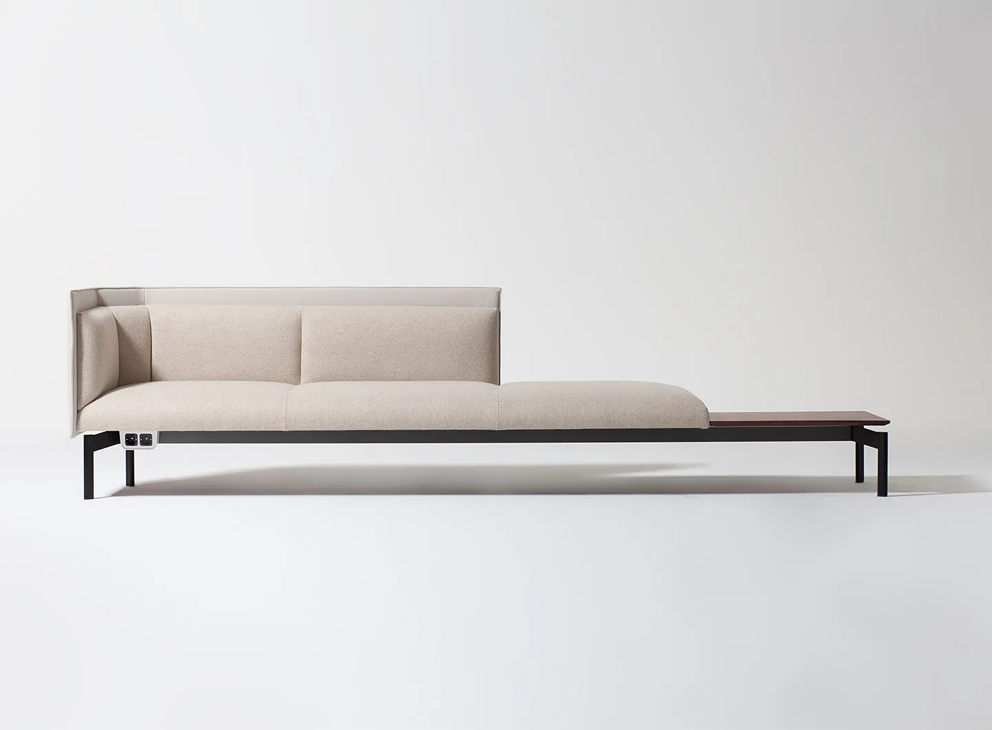
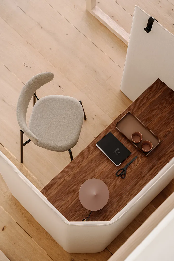
Thirty-two years old, a degree with top marks from IED and a working studio in Milan since 2015, from tableware to upholstered furniture Federica Biasi moves confidently through different areas of product design. She is loathe to be referred to as a “young designer”: to her mind, “insisting on the age of the people you work with can hide a lack of trust.” And yet far from being shouty, her design approach, based on soft colours and smooth, enveloping forms, has already won over many companies. Alongside major, long-term working relationships with other companies, for a while she has served as Mingardo and Manerba’s art director. During the recent design week, she presented a series of new pieces spawned by these collaborations, ranging from her Kokoro “office islands” to Easy Chair designed for Manerba, conceived for smart working and the growing cross-pollination between domestic spaces and workplaces, her Huli (for Frigerio) and Livre (for Gallotti&Radice) armchairs, initial pieces in a new collection she’s designing for LaCividina, and the Rue candelabrum, which is part of a larger project she’s curating for Mingardo.
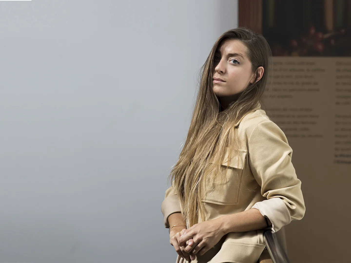
Federica Biasi by Lousteran
It’s true, “one shot” projects almost never interest me. In my opinion, it’s impossible to find the right feeling, to come up with the perfect product immediately if you just show up at a company, if you don’t find out about it. Design is always about human relationships; it takes time to create a climate of trust that pays off in the long run. For example, I worked with Gallotti&Radice on a number of designs before I came up with something like the Livre armchair, something that’s 100% me and 100% them. That’s why I always get upset if someone asks me for a product in an emailed brief. Sometimes a project happens, sometimes it doesn’t... it’s hard to know why. Maybe you were the right person but they didn’t really explain who they were. Every designer’s computer is filled with the right design for the wrong company.
We all spend loads of time working on projects that don’t pan out, on “unborn projects.” Designers’ hard disks are full of valid projects that have been seen by just a handful of people; it would be great to find a way to “deliver” them to the companies that could make them best.
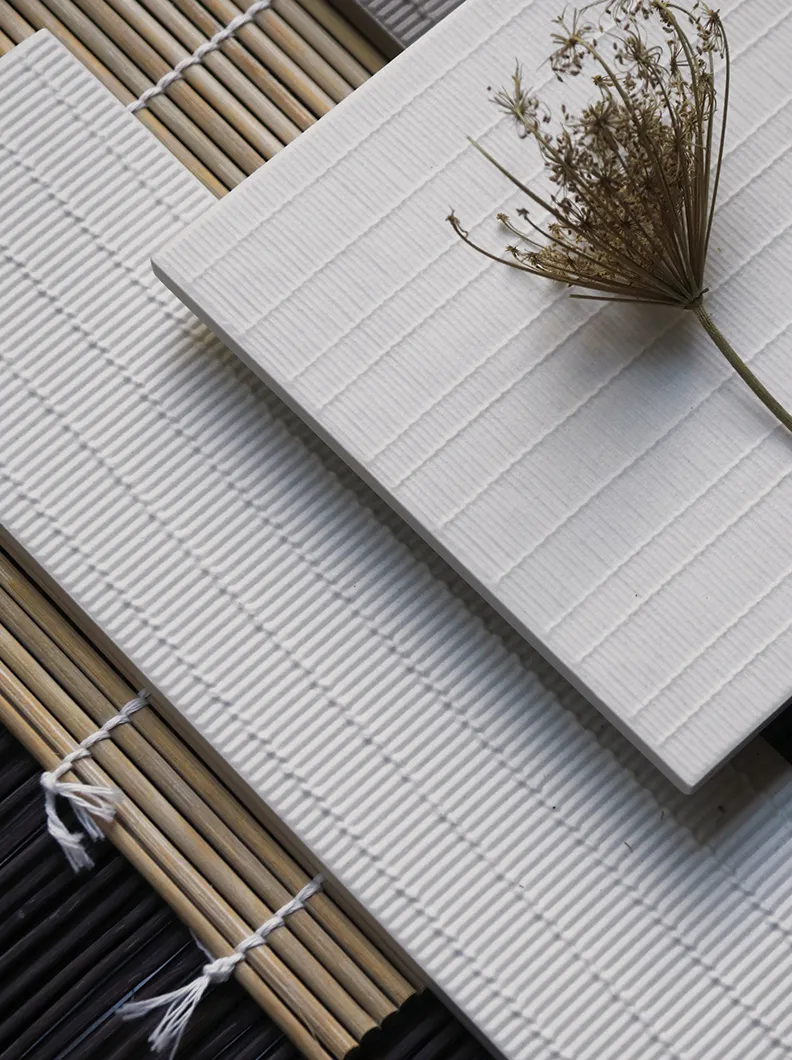
If I had to describe what we do in the studio, I would say it’s really a synthesis between Nordic style – and by that I mean space, light, soft colours, a certain way of using materials and looking for light within a product – and Japanese forms, which I like a lot. I also love the Japanese philosophy, its slowness, always looking for meaning behind things. Right now, we’re presenting a new collection of tiles I designed for Decoratori Bassanesi that refers to the Japanese cultural concept of Wabi-Sabi, the beauty of the imperfect. We created the decorations from existing textures, for example the knots in bamboo mats used to make sushi, retaining their small imperfections.
Yes, for a couple of years, working as a trend researcher for Fratelli Guzzini. I used to make trendbooks in which I jotted down everything going on in tableware in Northern Europe. This was in 2011-2012, when companies like Muuto and Normann Copenhagen brought to market well designed contemporary products and suddenly became industry trendsetters. I used to go to all the fairs, from Cologne to the Copenhagen Three Days of Design, taking in Stockholm too as I tried to understand what they were up to. It was a matter of changing a few colour and finish elements, and using that as a way of repositioning. This is the strength of contemporary Nordic design: always knowing how to present itself correctly, without leaving anything to chance.
Tough question! I value so many of them for different reasons. If they’ve managed to become modern-day design stars, in other words, if they’re holding the reins in this game, that’s precisely because each one of them has their strengths. One designer I particularly appreciate and keep a close eye on is, I must say, Piero Lissoni: talking about loyalty, he has managed to impose his style while at the same time building up loyalty with the companies he works with, to the point that it is no longer clear where the company begins and where he ends... and vice versa. What I really like about his designs is their quietness. When you look at a Lissoni product, you cannot perceive the technology that underlies it, not because it isn’t there but because what comes first is the product’s finesse, its dynamism, the idea that the product inhabits a space.
I always look out for the Bouroullec brothers, Stefan Diez – the Costume sofa he designed for Magis, for example, is a well thought out product, in which function comes before aesthetics – and Cecilie Manz... I like her because she has a feminine touch, even if she doesn’t necessarily express it in her decorations. Her recent Copenhagen exhibition was an extremely meticulous summary of the hidden work in industrial design.
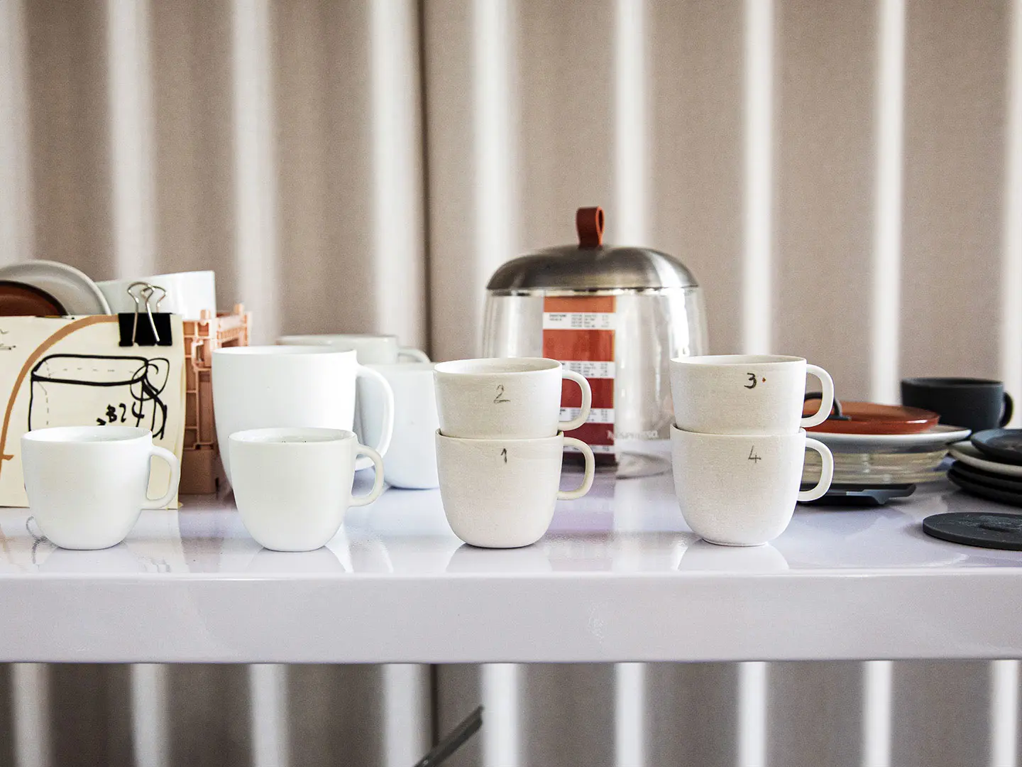
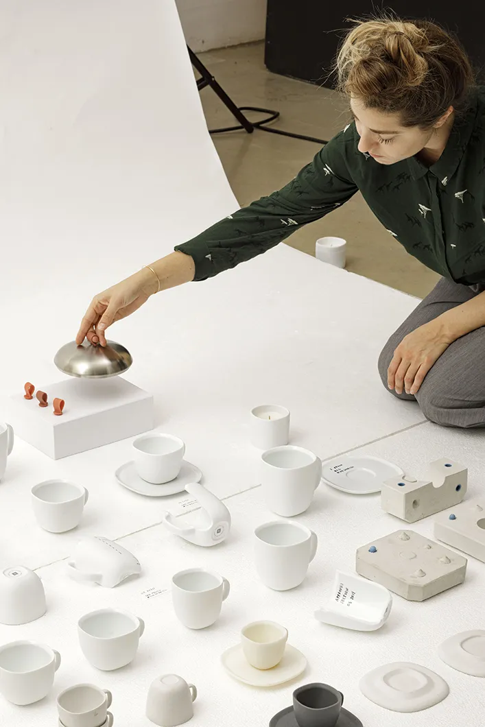
Lume by Federica Biasi for Nespresso
Right now, at a time when I’m designing a lot of upholstered furniture, I must say I’d have loved to design Mario Bellini’s Camaleonda sofa (from 1970) – to conceive it so intelligently and yet aesthetically correctly, timelessly beautiful…
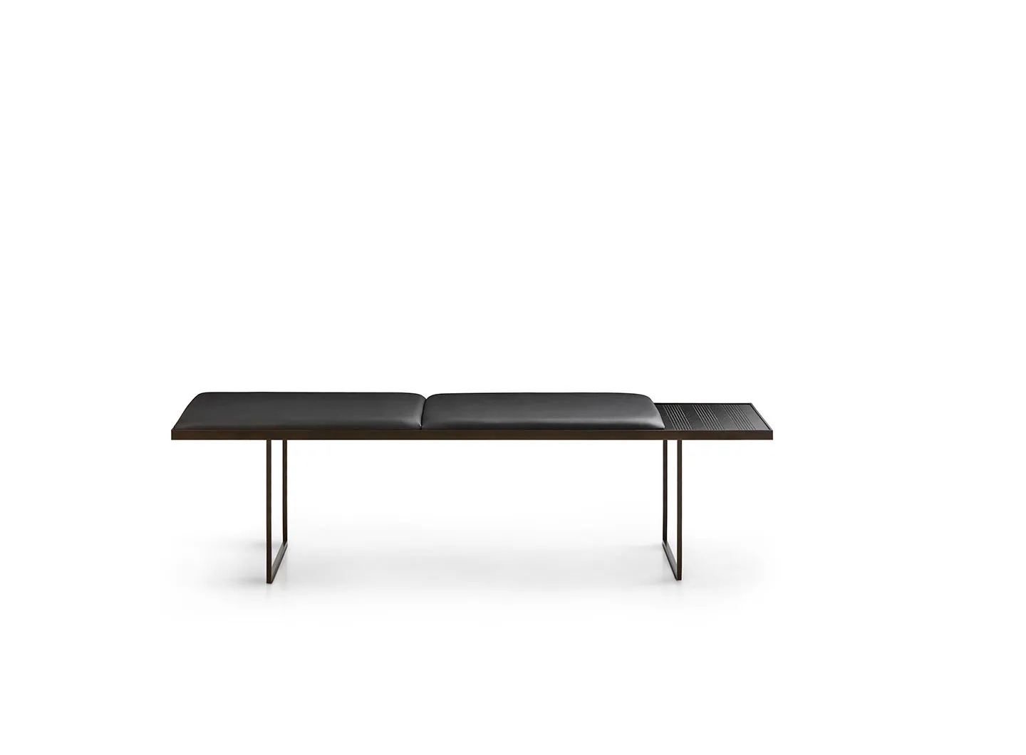
At the studio, we’re continuing to work on office systems, a field that I feel is mine, where we now have sufficient experience to understand what companies are looking for and what we’re looking for in a product. For LaCividina, we’ve just presented Timo, a small incipit of a chair and sofa collection that will grow much larger, which we’ll be unveiling in full at the next Salone, in April 2022. We are coming up with new products for Frigerio, after the Huli armchair and the Lume collection of cups and mugs I designed for Nespresso, which should be enriched with some elements. There’ll be a tableware collection we’re developing for a company that has nothing to do with furniture but works in the wine business… And over the next few months, two outdoor collections for a major industry company, whose name I am not at liberty to mention right now.
That depends. They’re often the result of brainstorming at the studio. Generally-speaking, we try and come up with a name that has to do with the product itself or has some meaning, without being too obvious. Rue, for example, the name we gave the candelabra I designed for Mingardo for A Flame for Research, means “street” in French. All the items in the project have something to do with the concepts of life and death. Rue extends in length, running along a kind of suspended track, thus representing the path of life. For Wabi-Sabi, which I mentioned earlier, the meaning is important, but so is the fact that it’s a compound word, because it’s a collection with two different designs.

In memoriam: David Lynch
The American director has left us at the age of 78. The Salone del Mobile.Milano had the honor of working with him during its 62nd edition, hosting his immersive installation titled “A Thinking Room”. An extraordinary journey into the depths of the mind and feelings. His vision will continue to be a source of inspiration.


 Stories
